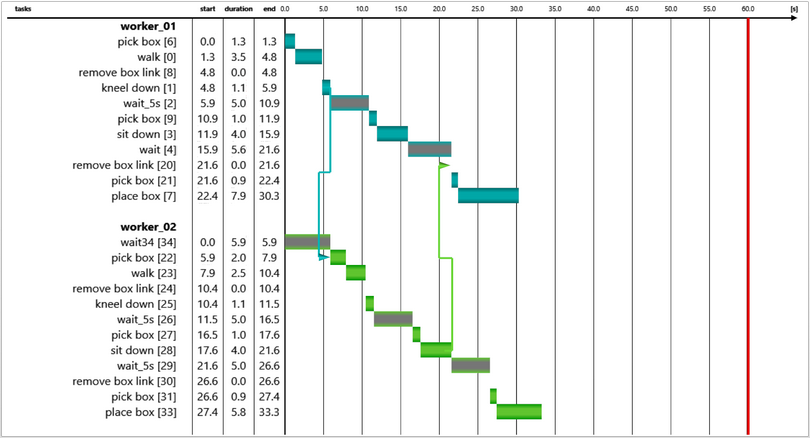
In the evaluation area the Gantt chart is displayed either pertaining to a worker or for all the workers/"Dynamic objects" in the scene. The information pertaining to each worker/"Dynamic objects" is color coded. Therefore, the chart is a useful tool to identify and resolve conflicts as well as to optimize the processes. This chart can also be interpreted as a table with horizontal bar chart.
The first column contains the Tasks / Task groups of the worker(s)/ "Dynamic objects". The Start time, Duration and the End time information can be seen in the next three columns respectively. The last column shows these information in a horizontal bar chart. The color code of the individual rectangular bar is same as that of the color code of the corresponding worker(s)/ "Dynamic object(s)" and represents the time between the start and end time. In case of Wait tasks, the rectangular bars will have an addition grey color in the middle. Furthermore, the inter and intra relationships between the tasks are depicted using an arrow. The color of the arrow is determined by the tasks (color of the associated bar) which precedes the other.

Figure 125: Description of the cycle time chart as Gantt-chart
![]() Default zoom - Output is shown back in the default zoom by clicking this button
Default zoom - Output is shown back in the default zoom by clicking this button
![]() Finer chart scale - making the scale of the chart finer enlarges the rectangular bars in the chart and thus the start and end times are more readable.
Finer chart scale - making the scale of the chart finer enlarges the rectangular bars in the chart and thus the start and end times are more readable.
![]() Default chart scale - the scale is reset to the default value
Default chart scale - the scale is reset to the default value
![]() Coarser chart scale - making the scale of the chart coarser reduces the size of the rectangular bars in the chart. This makes the chart more compact but less readable.
Coarser chart scale - making the scale of the chart coarser reduces the size of the rectangular bars in the chart. This makes the chart more compact but less readable.
![]() Cycle time - By selecting the defined behaviors, cycle time field appears wherein the cycle time for the selected behavior could be set.
Cycle time - By selecting the defined behaviors, cycle time field appears wherein the cycle time for the selected behavior could be set.
The control of the evaluation area view is similar to the 2D spaghetti chart (see chapter User interface / Tab "Results" / Spaghetti chart / Evaluation area).